examples
examples.Rmdscplot
This is a new add-on package to scanfor visualizing
single-case data: scplot. This function will gradually
replace the plot.scdf() (short: plot())
function already included in scan and finally be included
into to the scan package. Here are some advantages of using
scplot over the standard scan plot
function:
-
scplotis already much more versatile thanplothas been. -
scplotwas designed to encompass a pipe style coding which is much cleaner, more intelligible and easier to code. -
scplotis based onggplot2and produces aggplot2object which can be modified and extended to any wishes.
We consider the state of scplot to be
experimental. That is, the code and syntax might change in
future versions so backward compatibility is not guaranteed.
But we will keep the “old” plot.scdf in future versions
of scan.
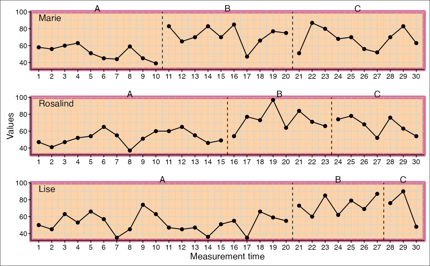
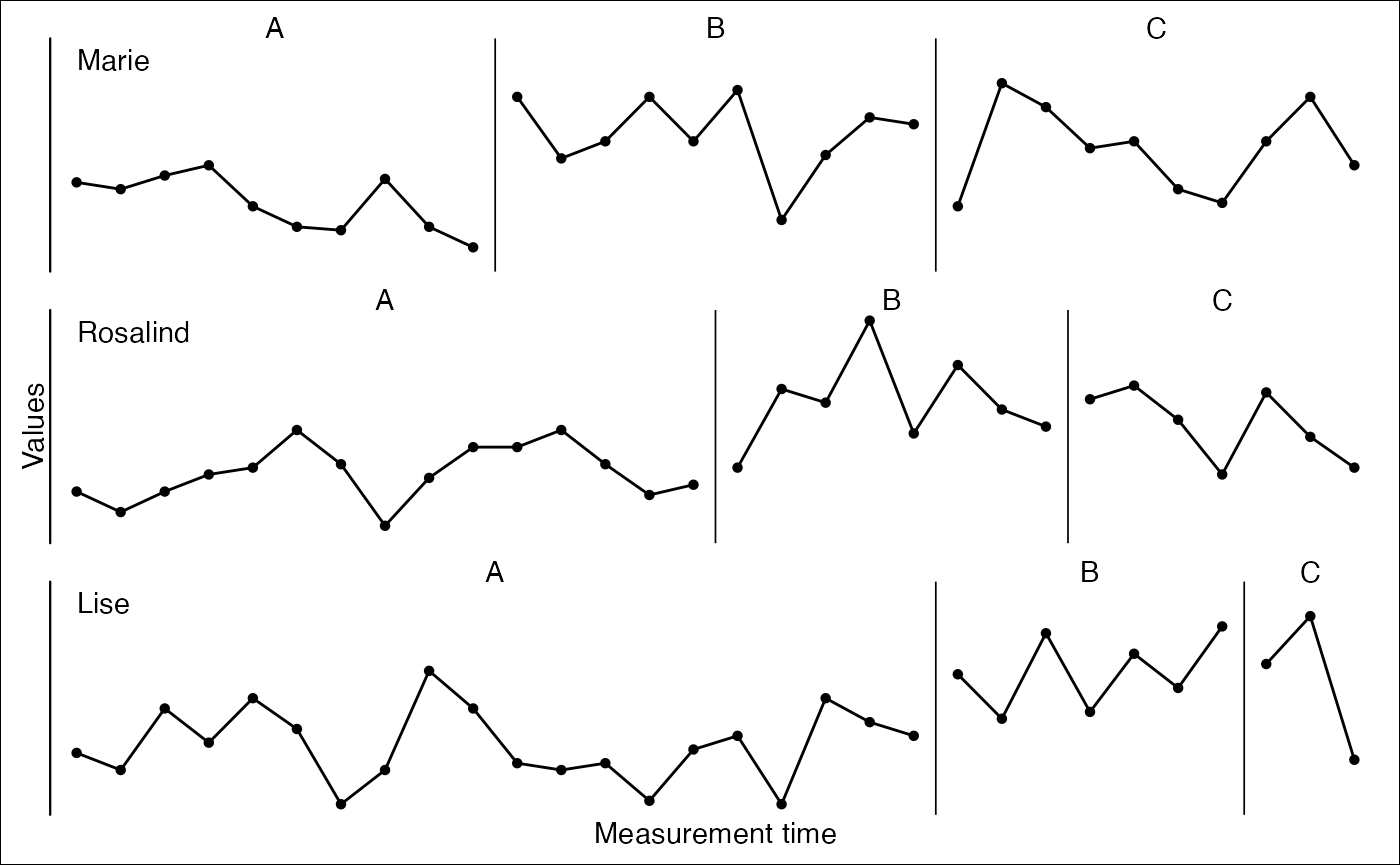
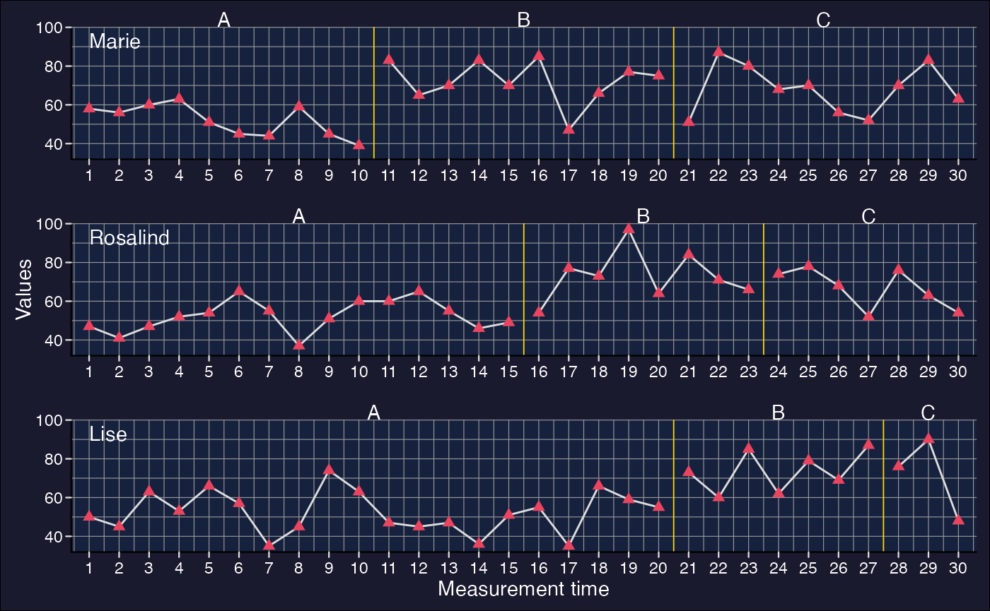
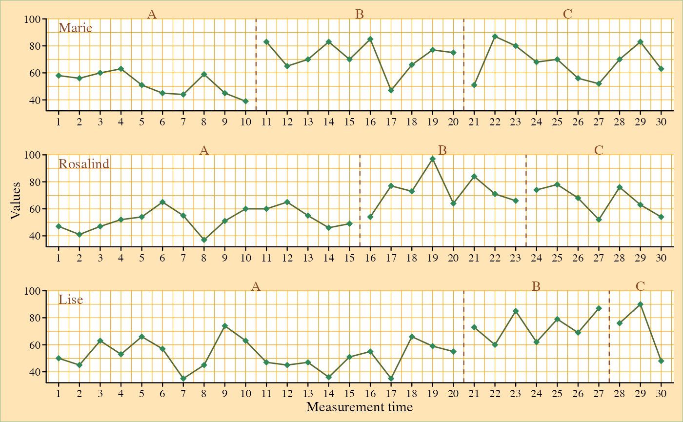
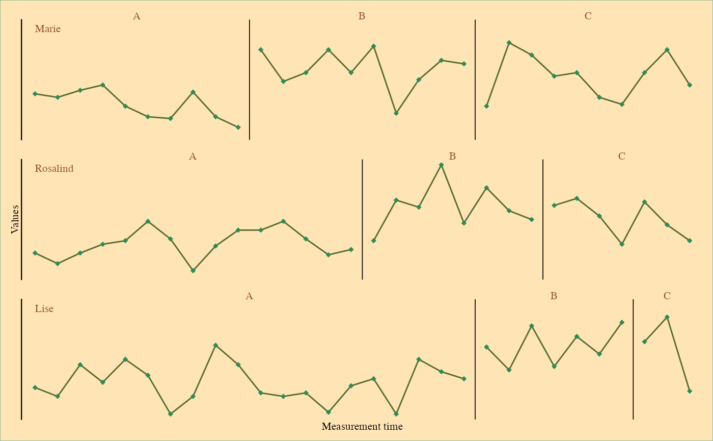
Here are a few plots that have been generated with
scplot to demonstrate its possibilities.
Install scplot
scplot is hosted as a gitHub project at https://github.com/jazznbass/scplot. You can install it
with
devtools::install_github("jazznbass/scplot", dependencies = TRUE)
from your R console. Make sure you have the package
devtools installed before. The package has to be compiled.
When you are running R on a Windows machine you also have to install
Rtools. Rtools is not an R package and can be downloaded from CRAN at https://cran.r-project.org/bin/windows/Rtools/. MacOs
and Linux users usually do not need to take this extra step.
Basic principal
You start by providing an scdf object (a single-case data frame as
returned from the scdf() function of scan) to the
scplot() function (e.g. scplot(exampleAB)).
Now you use a series of pipe-operators (%>% or
|>) to add and change characteristics of the resulting
plot. For example:
scplot(exampleABC) %>%
  add_title("My plot") %>%
  add_caption("Note: A nice plot")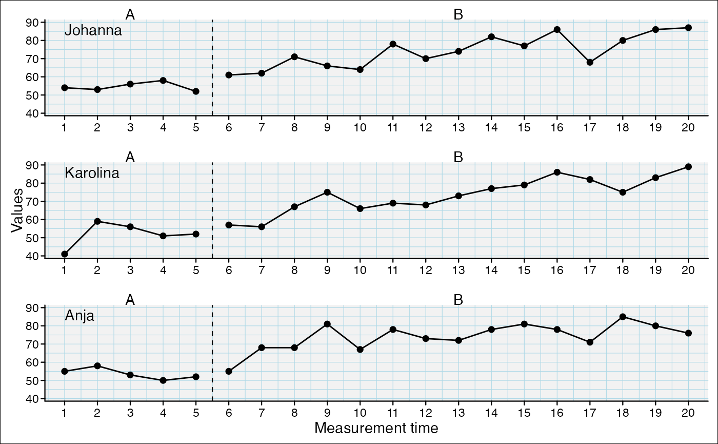
Add statlines
Lines indicating a constant for each phase
Possible functions: mean, min,
max, quantile
scplot(exampleABC) %>%
  add_statline("mean", color = "darkred") %>%
  add_statline("max", color = "darkblue", linetype = "dashed") %>%
  add_statline("min", color = "brown", linetype = "dashed")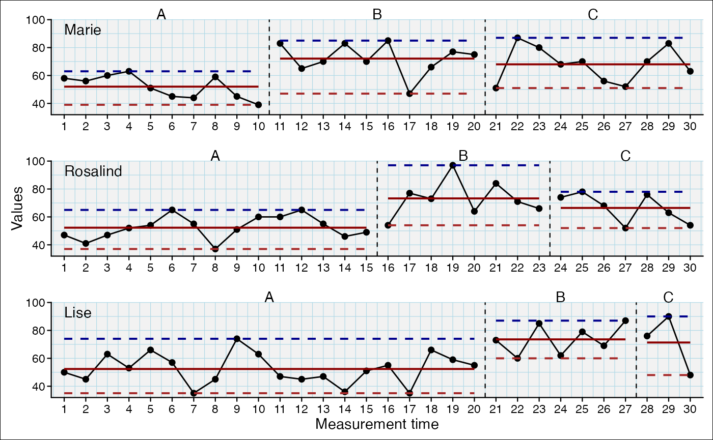
Lines indicating a constant for a specific phase
Set the phase argument with one or multiple phase-names
or phase-numbers
Possible functions: mean, min,
max, quantile
scplot(exampleABC) %>%
  add_statline("mean", phase = "A", color = "darkred") %>%
  add_statline("max", phase = c("B", "C"), color = "darkblue", linetype = "dashed") %>%
  add_statline("min", phase = c(2, 3), color = "orange", linetype = "dashed")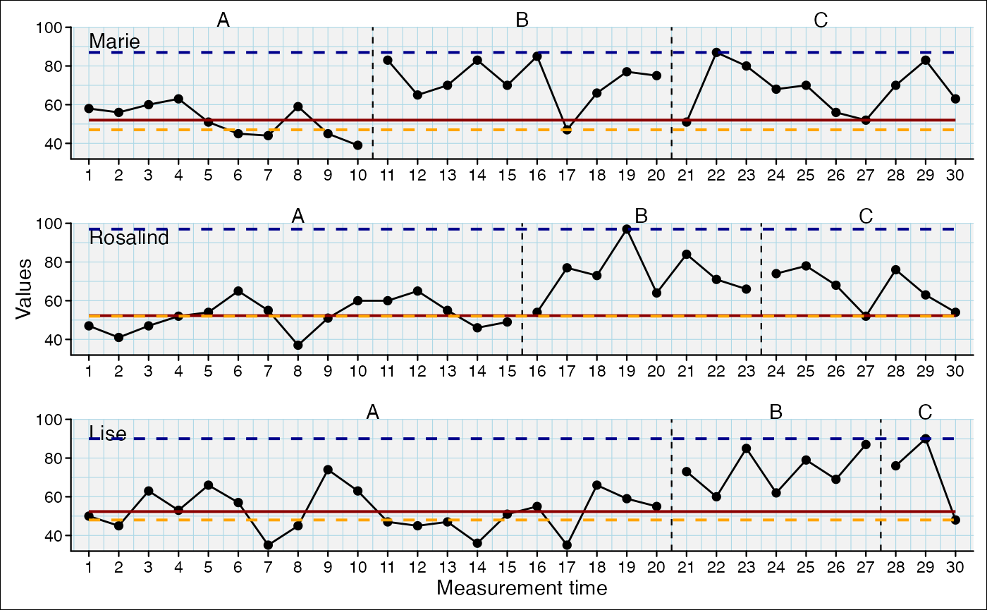
Trend-lines
trend (separate trend-line for each phase),
trendA (extrapolated trend-line of first phase):
scplot(exampleABC) %>%
  add_statline("trend", color = "darkred") %>%
  add_statline("trendA", color = "darkblue", linetype = "dashed")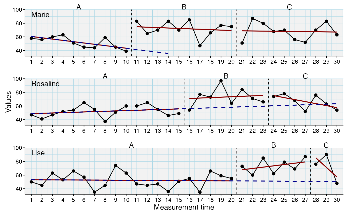
Smoothed curves
Possible functions: movingMean,
movingMedian, loess, lowess:
scplot(exampleABC) %>%
  add_statline("loess", color = "darkred") %>%
  add_statline("movingMean", color = "darkblue")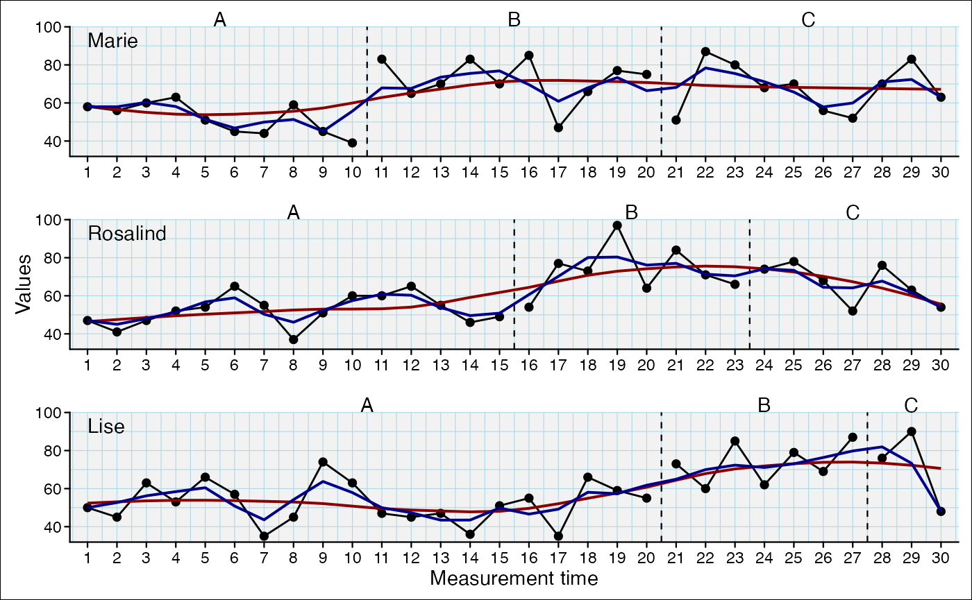
Refine with addidtional arguments
mean : trimquantile: probsmovingMean, movingMedian:
lagloess: spanlowess: f
scplot(exampleABC) %>%
  add_statline("movingMean", lag = 1, color = "darkblue") %>%
  add_statline("quantile", probs = 0.75, color = "darkred")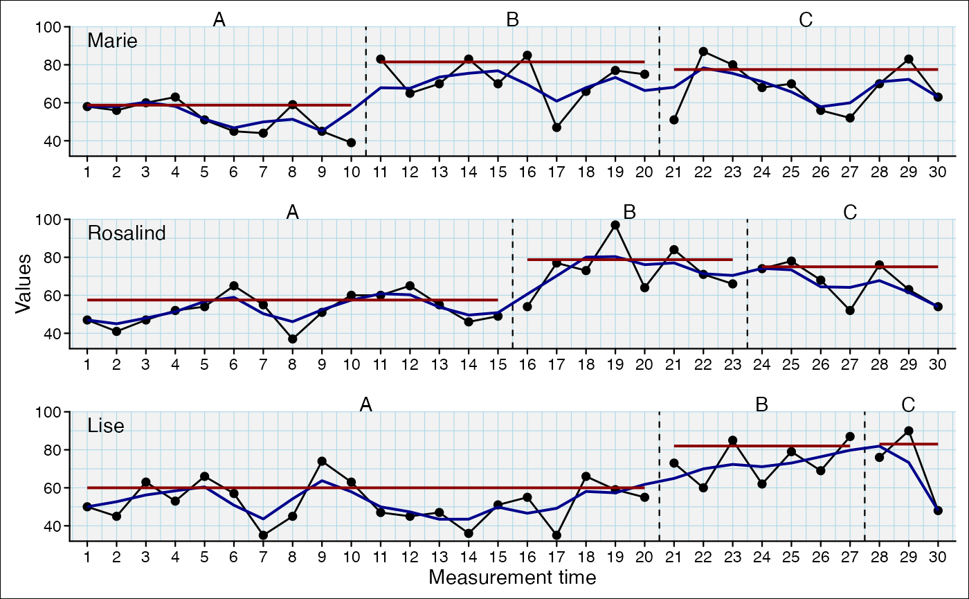
Specify data-line
If you do not specify the variable argument the default
first data-line is addressed.
scplot(exampleAB_add) %>%
  add_dataline("cigarrets") %>%
  add_statline("mean", variable = "cigarrets", color = "darkred") %>%
  add_statline("trend", linetype = "dashed")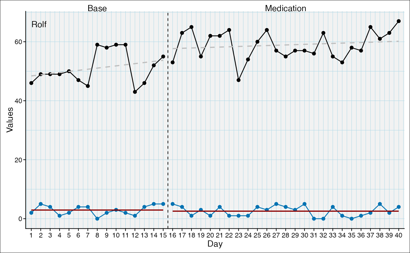
Annotate and mark
Add marks
The positions argument can take a numeric vector:
scplot(exampleABC) %>%
  add_marks(case = 1, positions = c(7, 12)) %>%
  add_marks(case = 3, positions = c(3, 17), color = "blue", size = 7)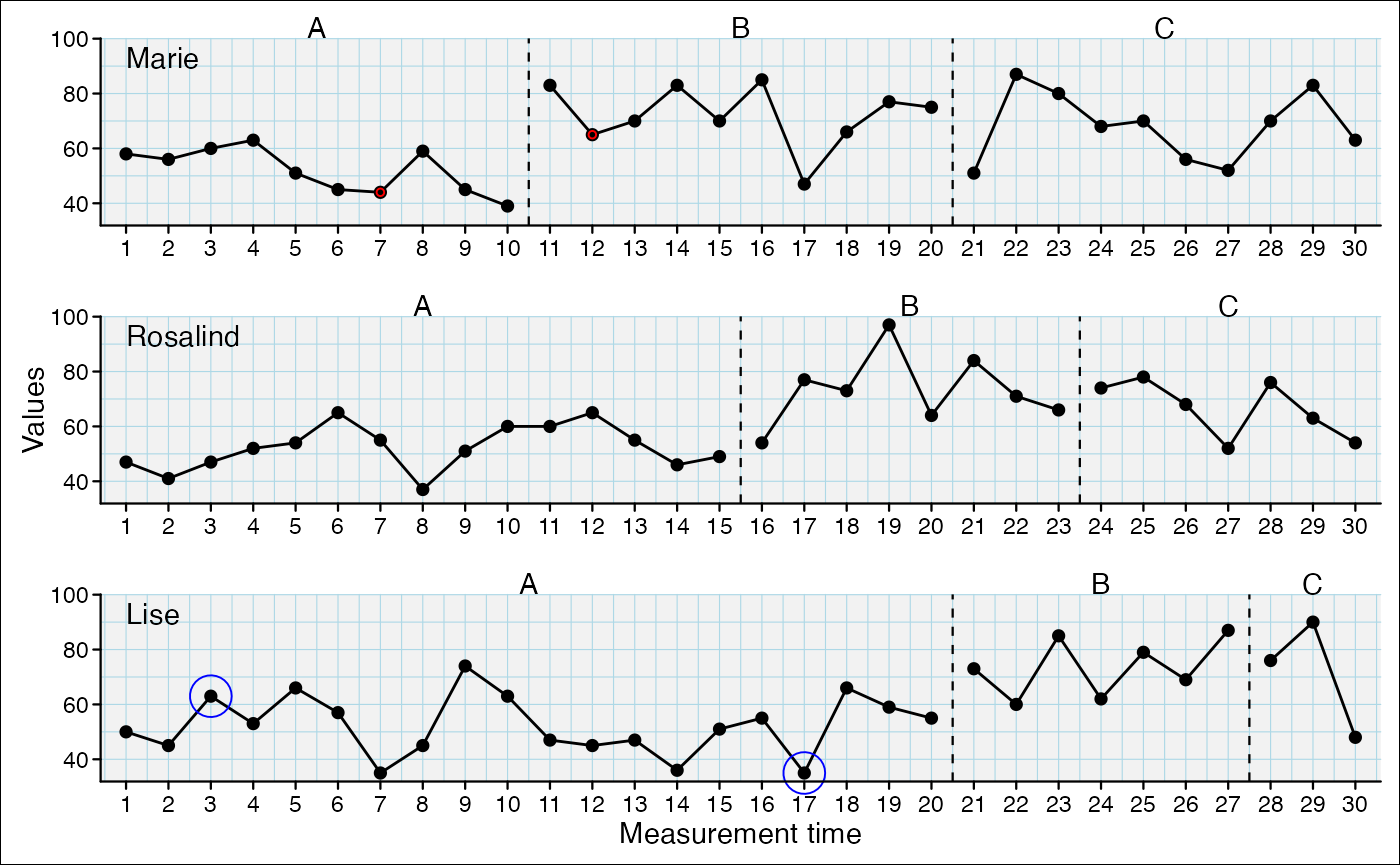
The positions argument can also be a string containing a logical expression. This will be evaluated and the respective positions will be marked.
scplot(exampleABC) %>%
  add_marks(case = 1, positions = "mt > 15") %>%
  add_marks(case = 2, positions = 'phase == "B"', color = "green", size = 5) %>%
  add_marks(case = 3, positions = "values > quantile(values, probs = 0.80)", color = "blue", size = 7) %>%
  add_marks(case = "all", positions = "values < quantile(values, probs = 0.20)", color = "yellow", size = 7) %>%
  add_caption("Note.
red: mt > 15 in case 1;
green: phase 'B' in case 2;
blue: values > 80% quantile of case 3;
yellow: values < 20% quantile of all cases")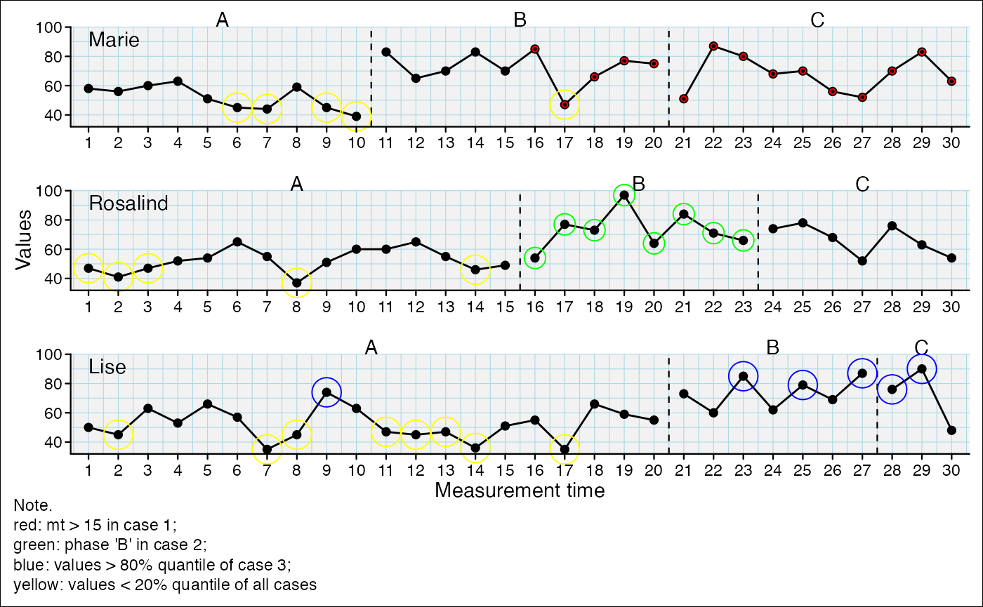
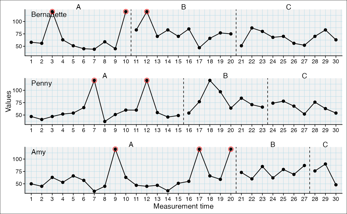
And the positions argument can take the results from a scan outlier analyses and mark the positions of the outliers of each case:
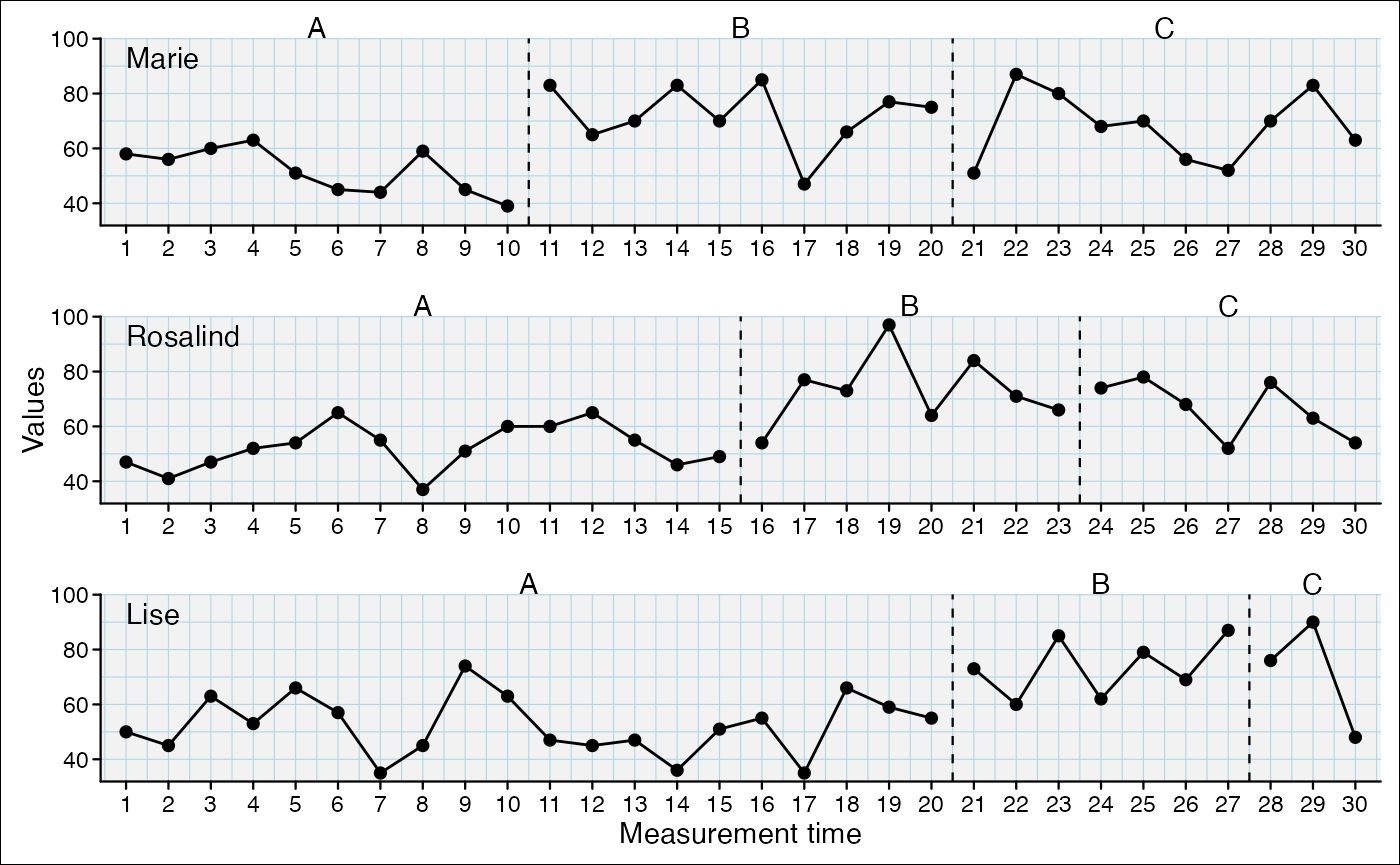
Change appearance of basic plot elements
Data line
scplot(exampleABC) %>%
  set_dataline(colour = "blue", linewidth = 1, linetype = "dotted",
               point = list(colour = "red", size = 1, shape = 2) )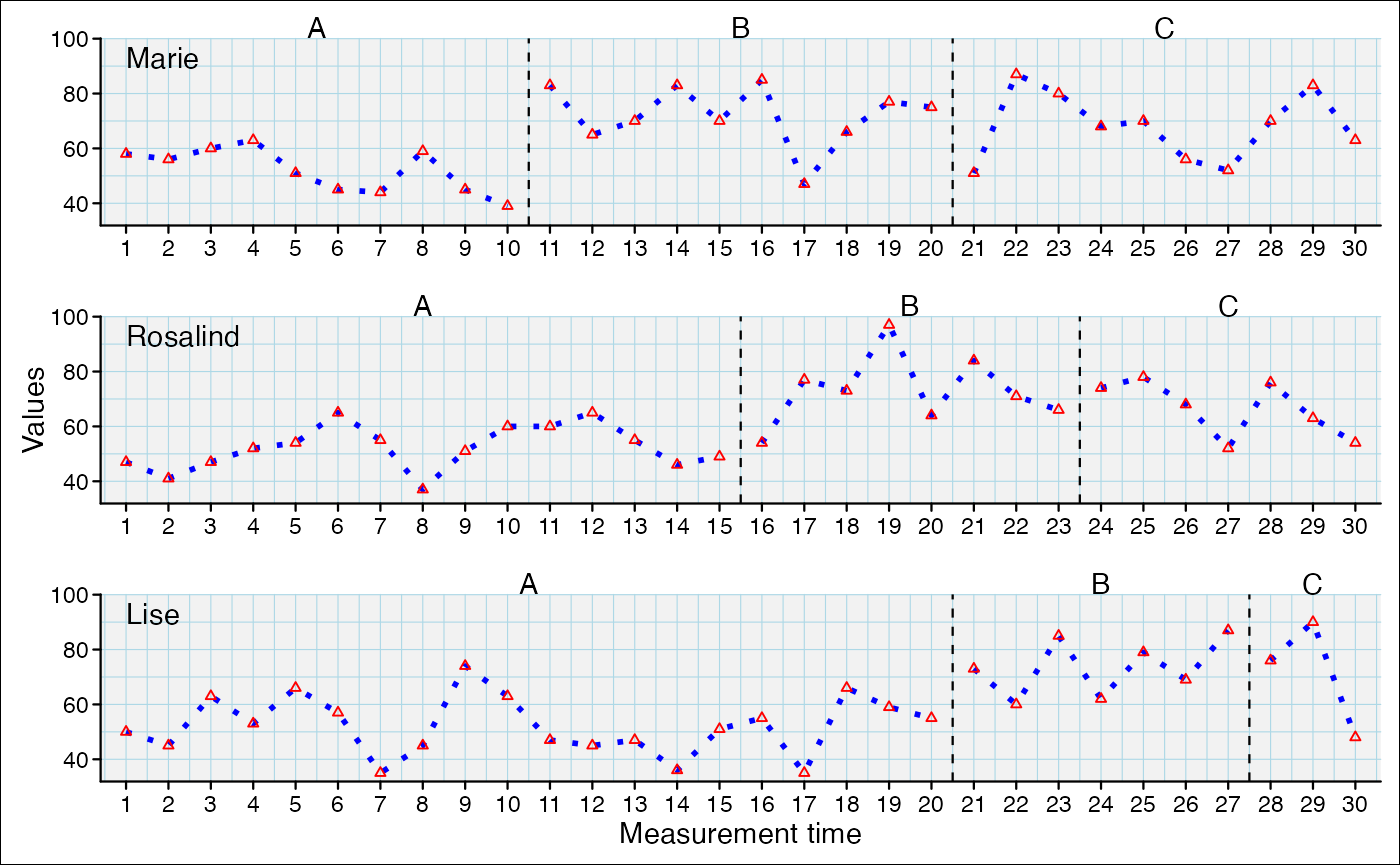
# Equivalent_
# scplot(exampleABC) %>%
#   set_dataline(line = list(colour = "blue", size = 1, linetype = "dotted"),
# point = list(colour = "red", size = 1, shape = 2)) 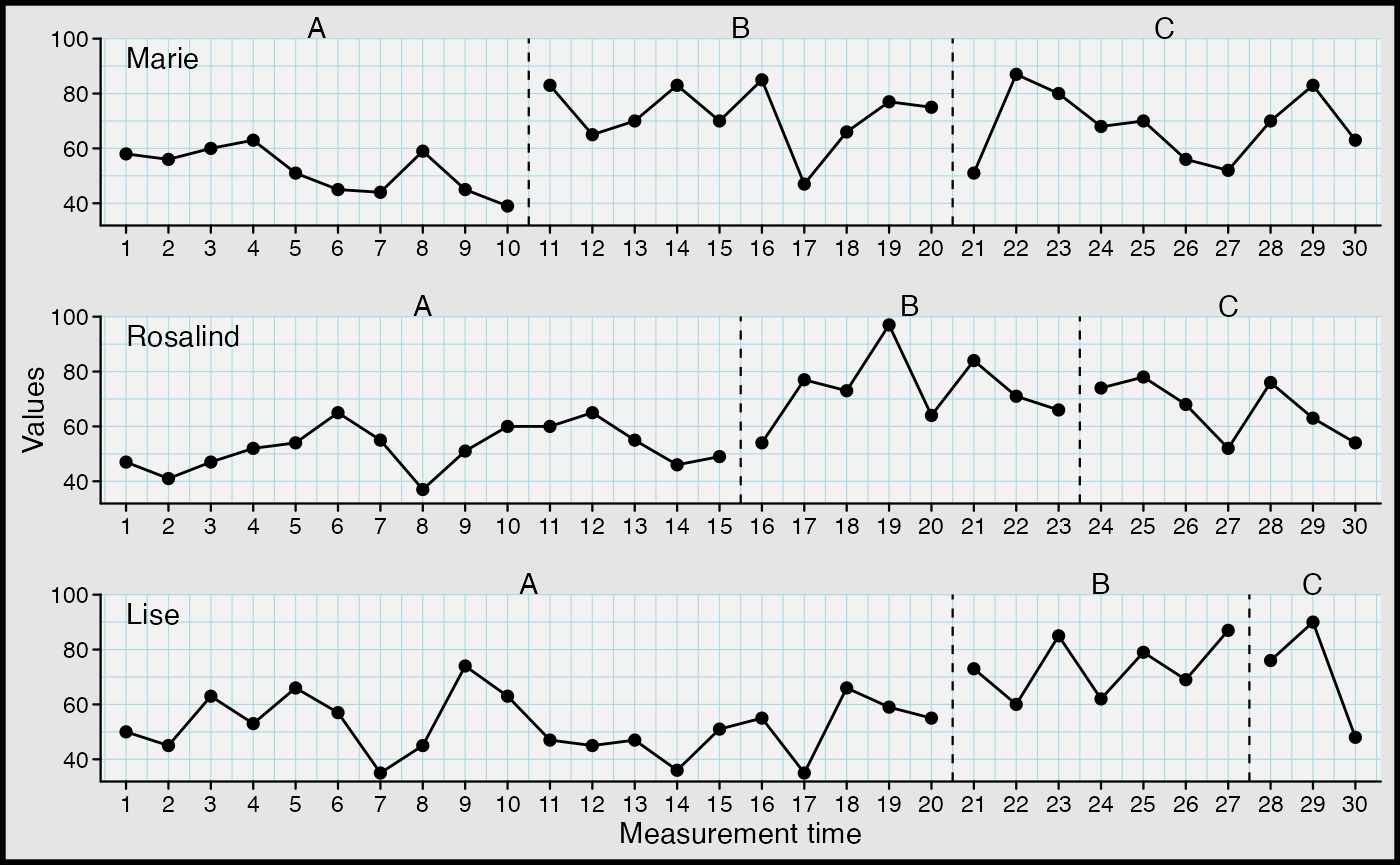
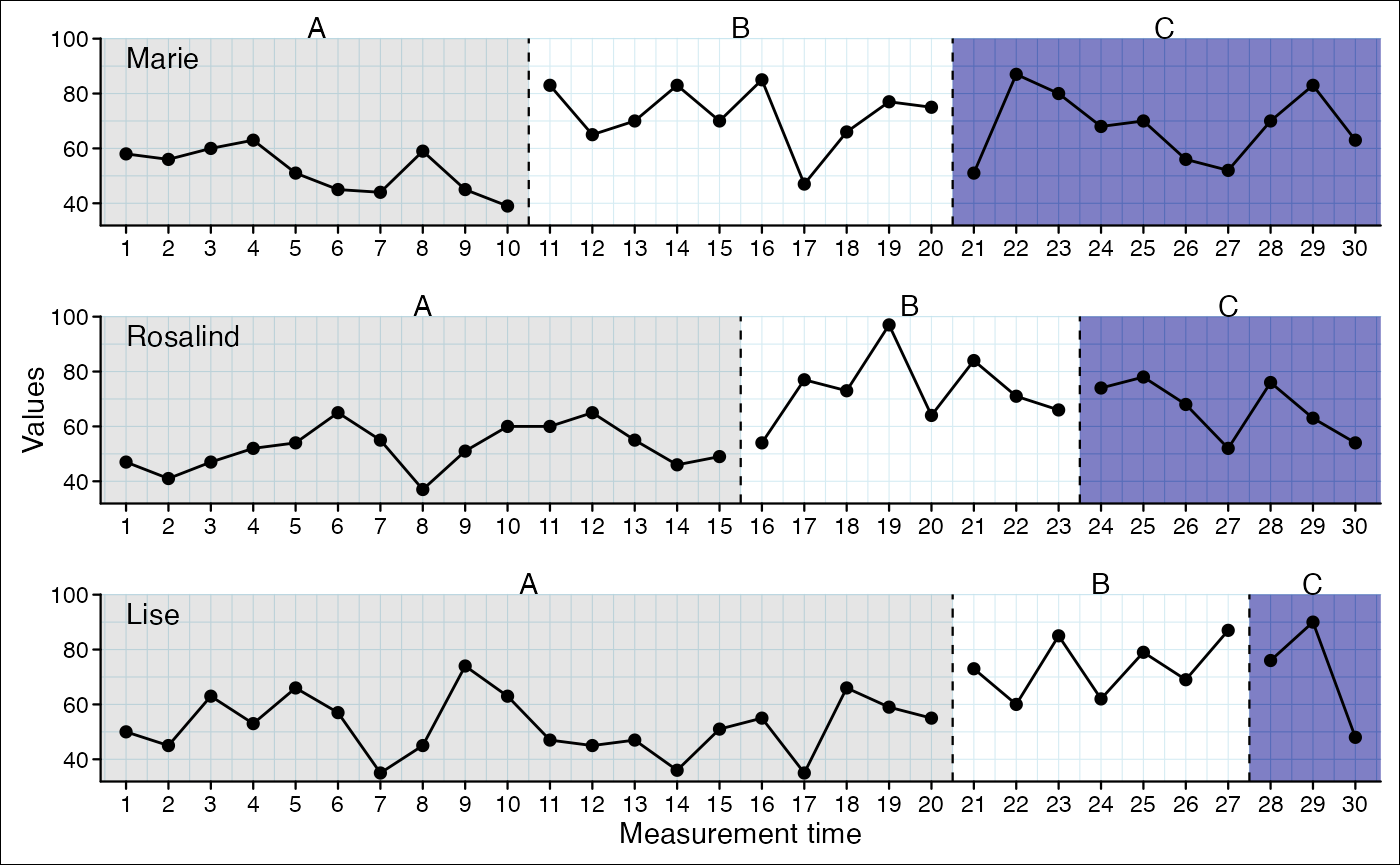
Themes
Themes are complete styles that define various elements of a plot.
Function add_theme("theme_name")
Possible themes:
basic, grid, default,
small, tiny, big,
minimal, dark, sienna,
phase_color, phase_shade,
grid2
Combine themes
When providing multiple themes the order is important as the latter overwrites styles of the former.
Set base text
The base text size is the absolute size. All other text sizes are relative to this base text size.
scplot(exampleAB_decreasing$Peter) %>%
  set_base_text(colour = "blue", family = "serif", face = "italic", size = 14)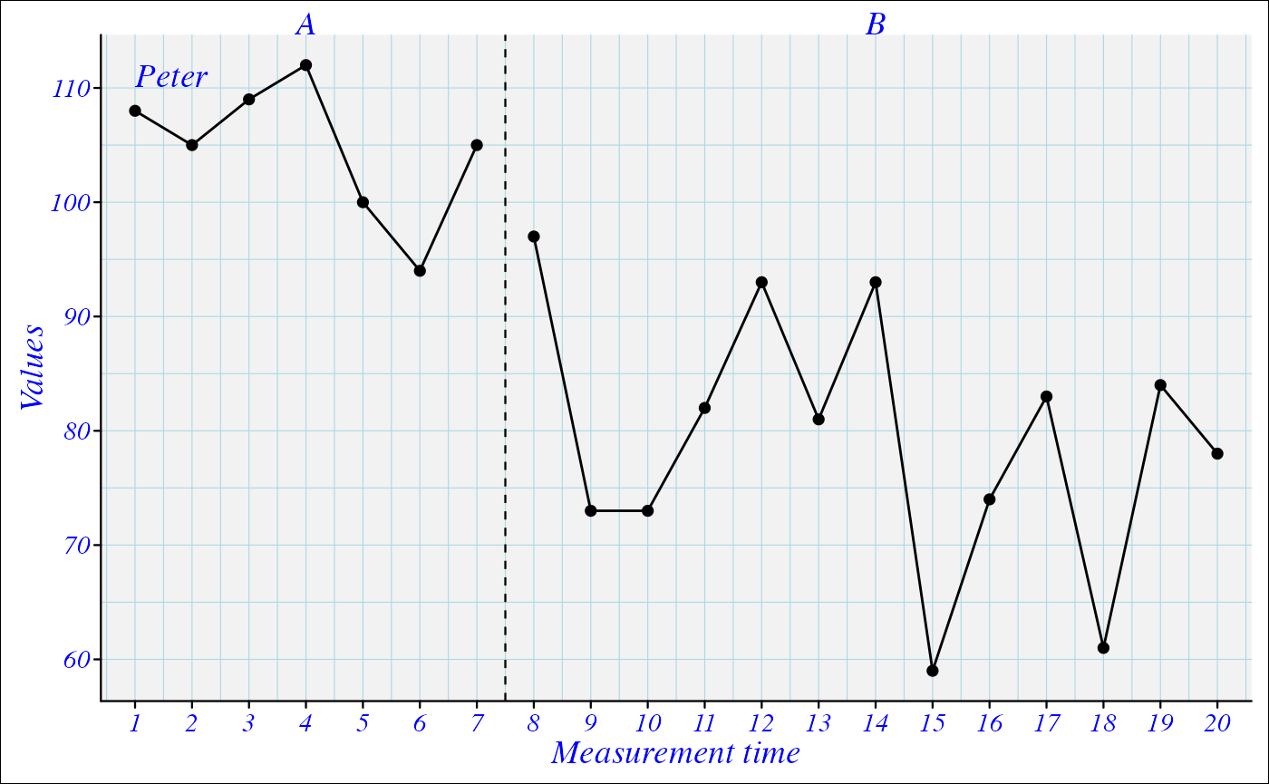
Add title and caption
scplot(exampleAB_decreasing) %>%
  add_title("A new plot", color = "darkblue", size = 1.3) %>%
  add_caption("Note. What a nice plot!", face = "italic", colour = "darkred")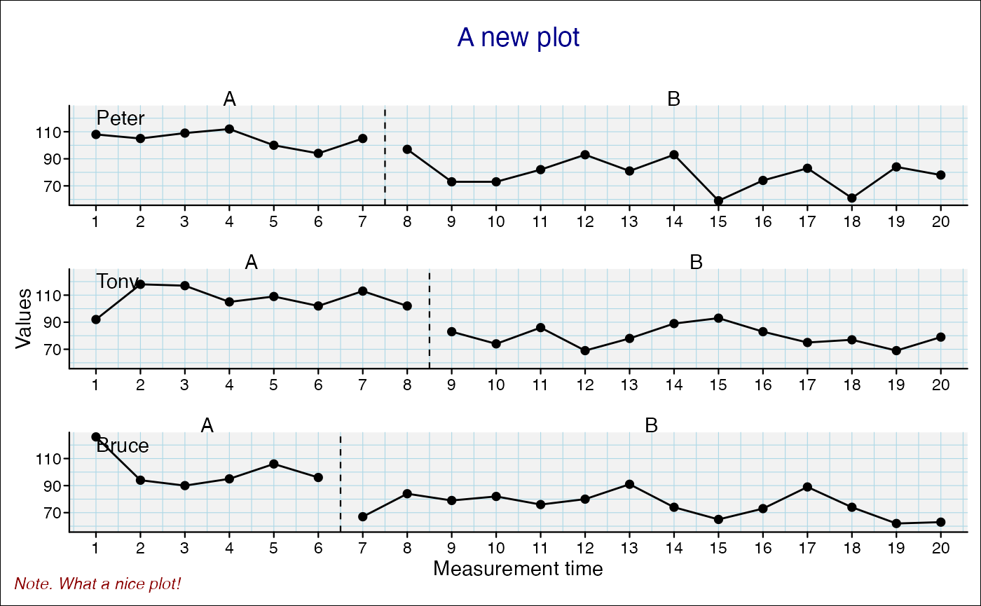
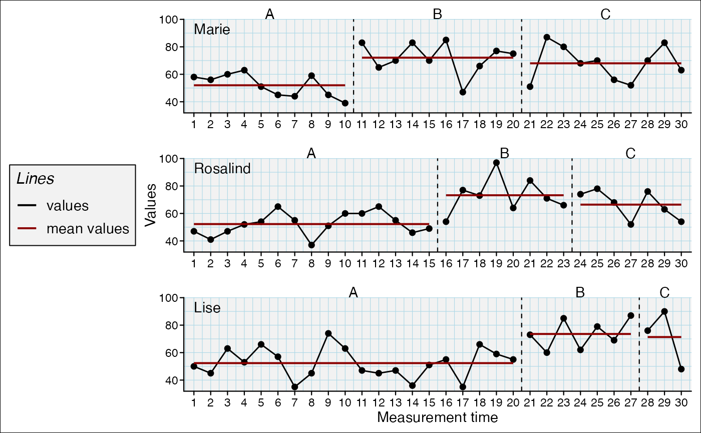
Add a legend
scplot(exampleABC) %>%
  add_statline("mean", color = "darkred") %>%
  add_statline("min", phase = "B", linewidth = 0.2, color = "darkblue") %>%
  add_legend()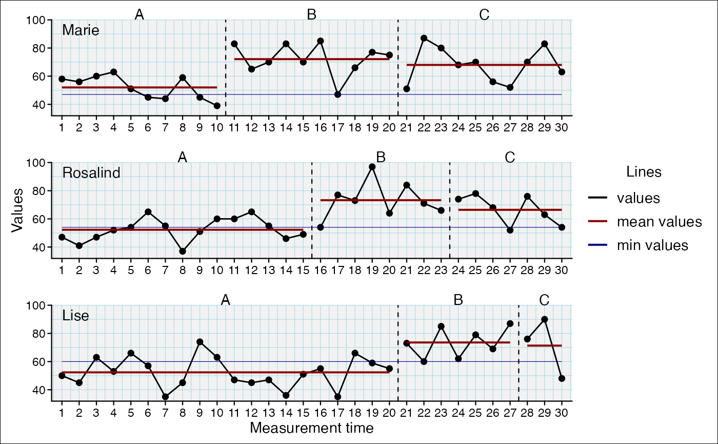
and set specific elements
scplot(exampleABC) %>%
  add_statline("mean", color = "darkred") %>%
  add_legend(
    position = "left",
    title = list(size = 12, face = "italic"),
    background = list(fill = "grey95", colour = "black")
  )
Customize axis settings
When axis ticks are to close together set the increment argument to
leave additional space (e.g. increment = 2 will annotate
every other value). When you set increment_from = 0 an
additional tick will be set at 1 although counting of the increments
will start at 0.
scplot(exampleA1B1A2B2) %>%
  set_xaxis(increment_from = 0, increment = 5,
            color = "darkred", size = 0.7, angle = -90) %>%
set_yaxis(limits = c(0, 50), size = 0.7, color = "darkred") 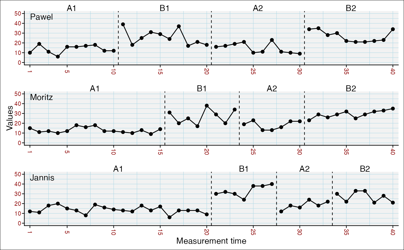
Customize axis labels
scplot(exampleA1B1A2B2) %>%
  set_ylabel("Score", color = "darkred", angle = 0) %>%
  set_xlabel("Session", color = "darkred")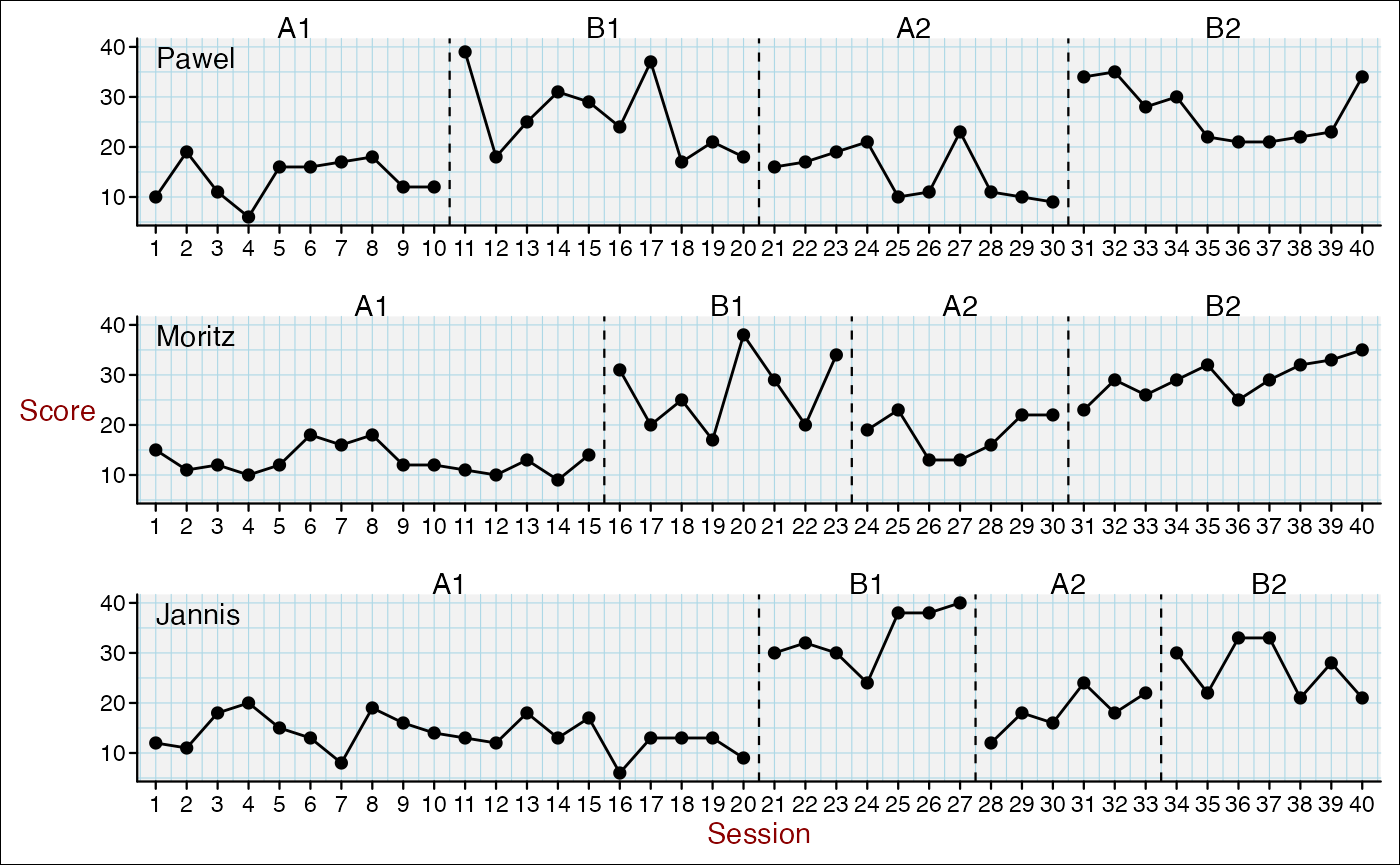
Change Casenames
scplot(exampleA1B1A2B2) %>%
  set_casenames(c("A", "B", "C"), color = "darkblue", size = 1)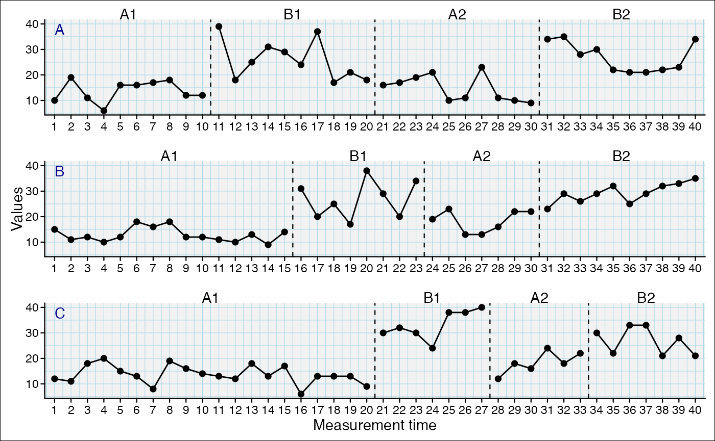
Casenames as strips:
scplot(exampleA1B1A2B2) %>%
  set_casenames(position = "strip",
                background = list(fill = "lightblue"))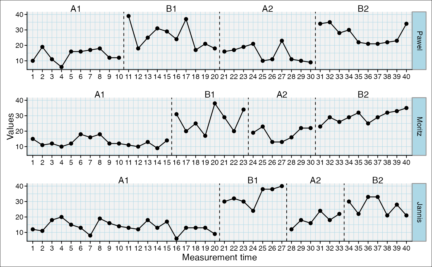
Add value labels
scplot(exampleABC) %>%
  add_labels(text = list(color = "black", size = 0.7),
             background = list(fill = "grey98"), nudge_y = 7)
If you set the nudge_y argument to 0, the label will be
set on-top the datapoints:
scplot(exampleABC) %>%
  add_labels(text = list(color = "black", size = 0.7),
             background = list(fill = "grey98"), nudge_y = 0)
Extending scplot with ggplot2
scplot() generates ggplot2 objects. You can keep the
ggplot2 object and assign it into a new object with the
as_ggplot() function. Thereby, you can use many ggplot2
functions to rework your graphics:
p1 <- scplot(byHeart2011$`Lisa (Turkish)`) %>%
        add_theme("minimal") %>%
        as_ggplot()
p2 <- scplot(byHeart2011$`Patrick (Spanish)`) %>%
        add_theme("minimal") %>%
        as_ggplot()
p3 <- scplot(byHeart2011$`Anna (Twi)`) %>%
        add_theme("minimal") %>%
        as_ggplot()
p4 <- scplot(byHeart2011$`Melanie (Swedish)`) %>%
        add_theme("minimal") %>%
        as_ggplot()

library(patchwork)
p1 + p2 + p3 + p4 + plot_annotation(tag_levels = "a", tag_suffix =  ")")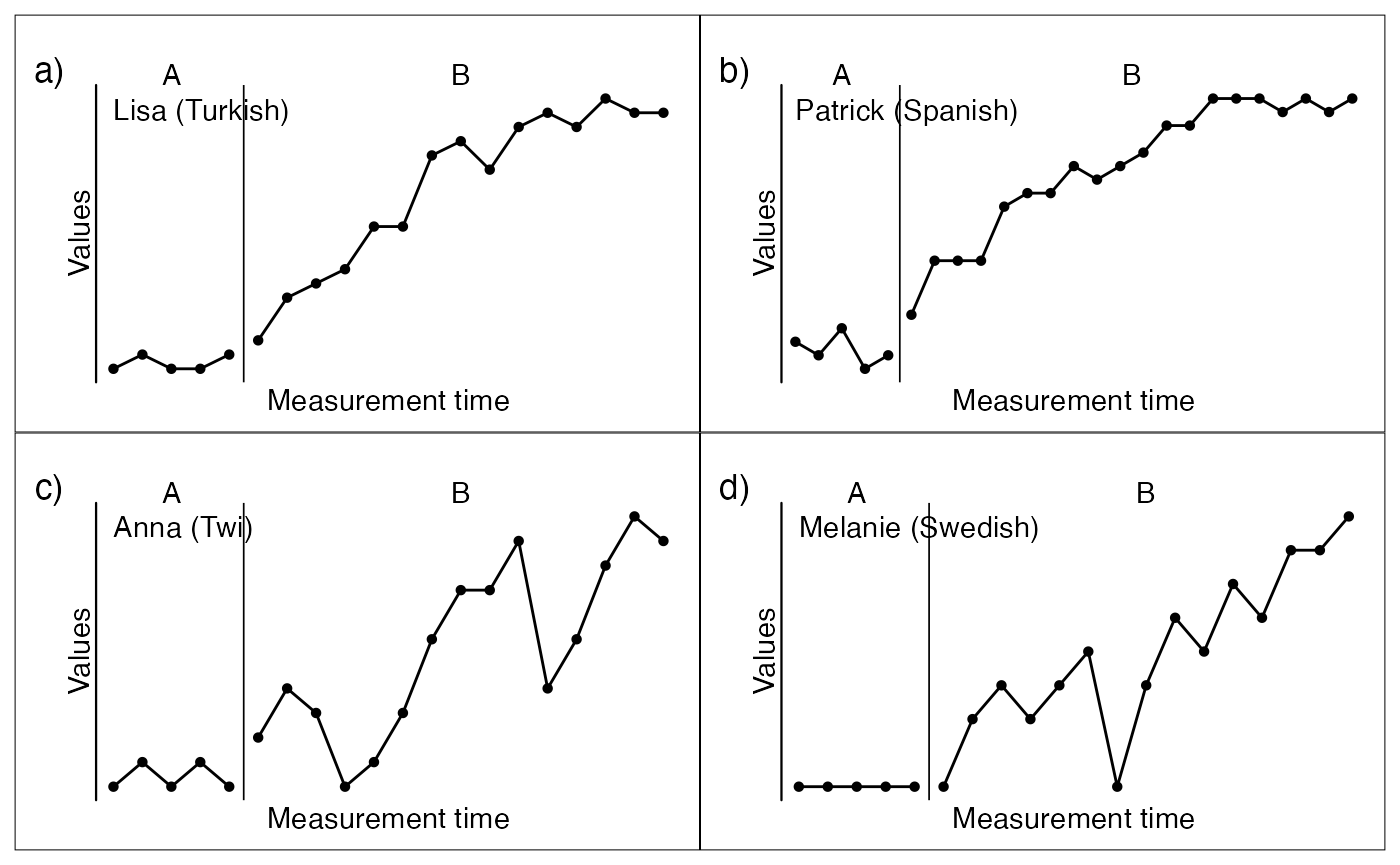
Complexs examples
Here are some more complex examples
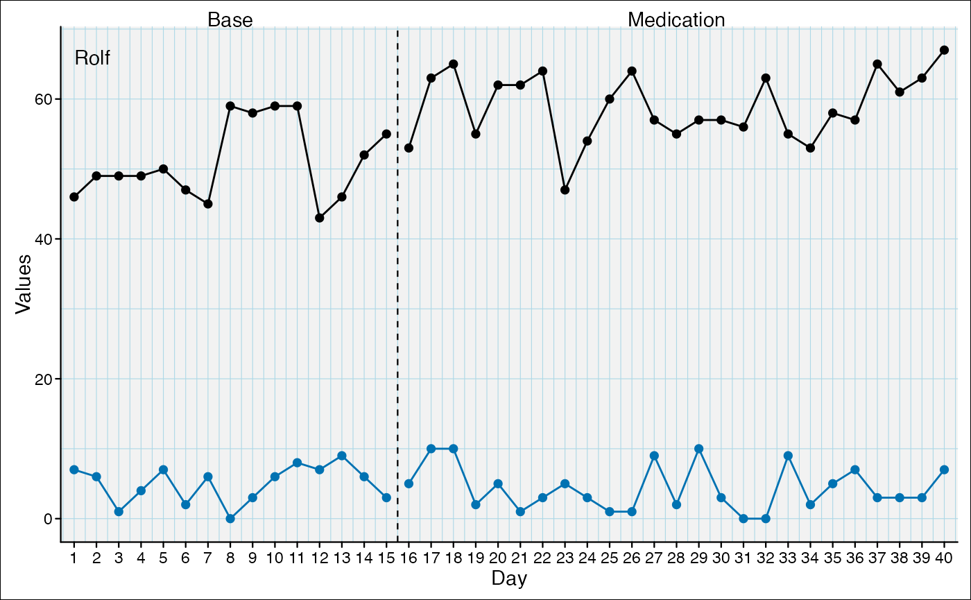
scplot(example_A24) %>%
  add_theme("default") %>%
  add_statline("lowess", color = "darkred", linewidth = 1.5) %>%
  add_statline("loess", color = "red", linewidth = 1.5) %>%
  add_statline("movingMean", lag = 3, color = "lightpink", linewidth = 1.5) %>%
  set_xaxis(size = 0.8, angle = 35) %>%
  set_dataline(point = "none") %>%
  add_legend(position = c(0.8, 0.75), background = list(color = "grey50")) %>%
  set_phasenames(c("no speedlimit", "with speedlimit"), position = "left",
                 hjust = 0, vjust = 1) %>%
  set_casenames("") %>%
  add_title("Effect of a speedlimit on the A24") %>%
  add_caption("Note: Moving mean calculated with lag three", face = 3) %>%
  add_ridge(color = "lightblue")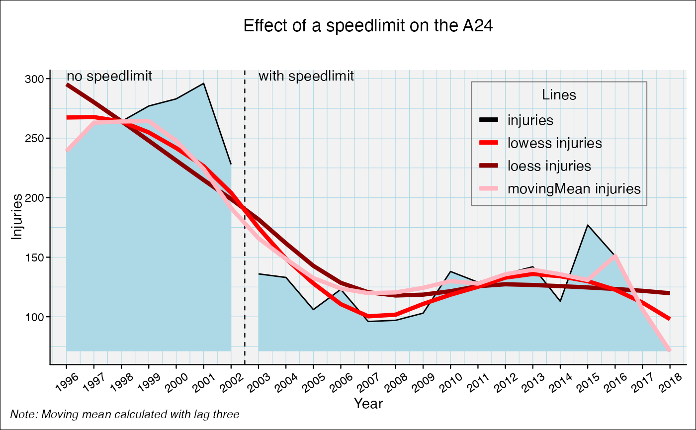
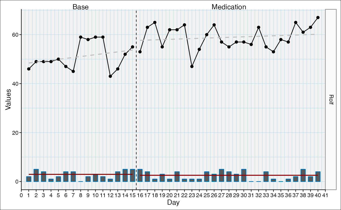
scplot(exampleAB_add) %>%
  add_dataline("cigarrets", point = list(size = 1)) %>%
  add_statline("trend", linetype = "dashed") %>%
  add_statline("mean", variable = "cigarrets", color = "darkred") %>%
  add_marks(positions = c(14,20), size = 3, variable = "cigarrets")%>%
  add_marks(positions = "cigarrets > quantile(cigarrets, 0.75)", size = 3) %>%
  set_xaxis(increment = 5) %>%
  set_phasenames(color = NA) %>%
  set_casenames(position = "strip") %>%
  add_legend(
    section_labels = c("", ""),
    labels = c(NA, NA, "Mean of cigarrets", "Trend of wellbeing"),
    text = list(face = 3)
  ) %>%
  set_panel(fill = c("lightblue", "grey80")) %>%
  add_ridge(color = "snow", variable = "cigarrets") %>%
  add_labels(variable = "cigarrets", nudge_y = 2,
             text = list(color = "blue", size = 0.5)) %>%
  add_labels(nudge_y = 2, text = list(color = "black", size = 0.5),
             background = list(fill = "white"))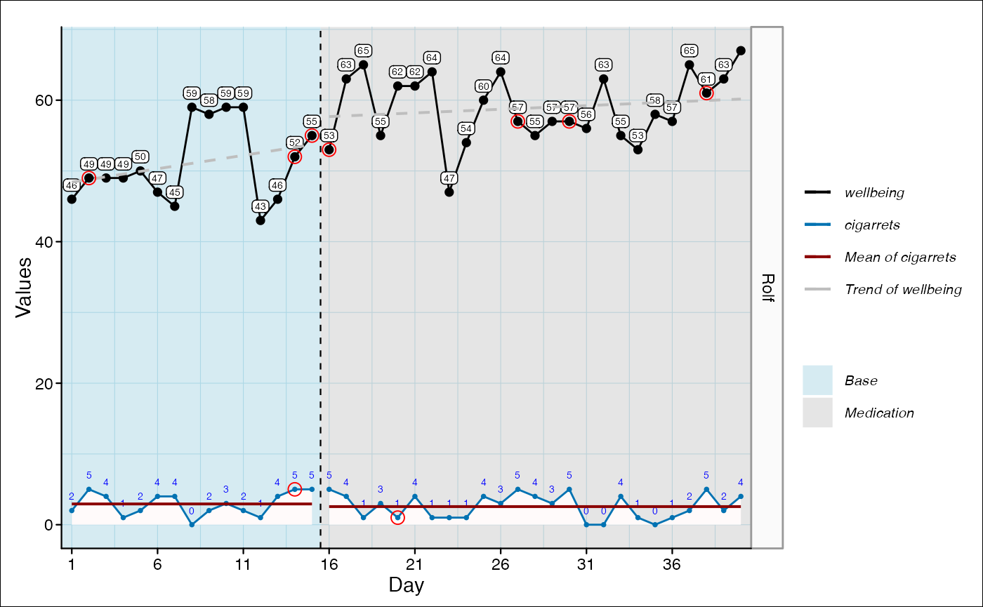
scplot(exampleA1B1A2B2) %>%
  set_xaxis(increment = 4, color = "brown") %>%
  set_yaxis(color = "sienna3") %>%
  set_ylabel("Points", color = "sienna3", angle = 0) %>%
  set_xlabel("Weeks", size = 1, color = "brown") %>%
  add_title("Points by week", color = "sienna4", face = 3) %>%
  add_caption("Note: An extensive Example.",
              color = "black", size = 1, face = 3) %>%
  set_phasenames(c("Baseline", "Intervention", "Fall-Back", "Intervention_2"),
                 size = 0) %>%
  add_ridge(alpha("lightblue", 0.5)) %>%
  set_casenames(labels = sample_names(3), color = "steelblue4", size = 0.7) %>%
  set_panel(fill = c("grey80", "grey95"), color = "sienna4") %>%
  add_grid(color = "grey85", linewidth = 0.1) %>%
  set_dataline(size = 0.5, linetype = "solid",
               point = list(colour = "sienna4", size = 0.5, shape = 18)) %>%
  add_labels(text = list(color = "sienna", size = 0.7), nudge_y = 4) %>%
  set_separator(size = 0.5, linetype = "solid", color = "sienna") %>%
  add_statline(stat = "trendA", color = "tomato2") %>%
  add_statline(stat = "max", phase = c(1, 3), linetype = "dashed") %>%
  add_marks(case = 1:2, positions = 14, color = "red3", size = 2, shape = 4) %>%
  add_marks(case = "all", positions = "values < quantile(values, 0.1)",
            color = "blue3", size = 1.5) %>%
  add_marks(positions = outlier(exampleABAB), color = "brown", size = 2) %>%
  add_text(case = 1, x = 5, y = 35, label = "Interesting",
           color = "darkgreen", angle = 20, size = 0.7) %>%
  add_arrow(case = 1, 5, 30, 5, 22, color = "steelblue") %>%
  set_background(fill = "white") %>%
  add_legend()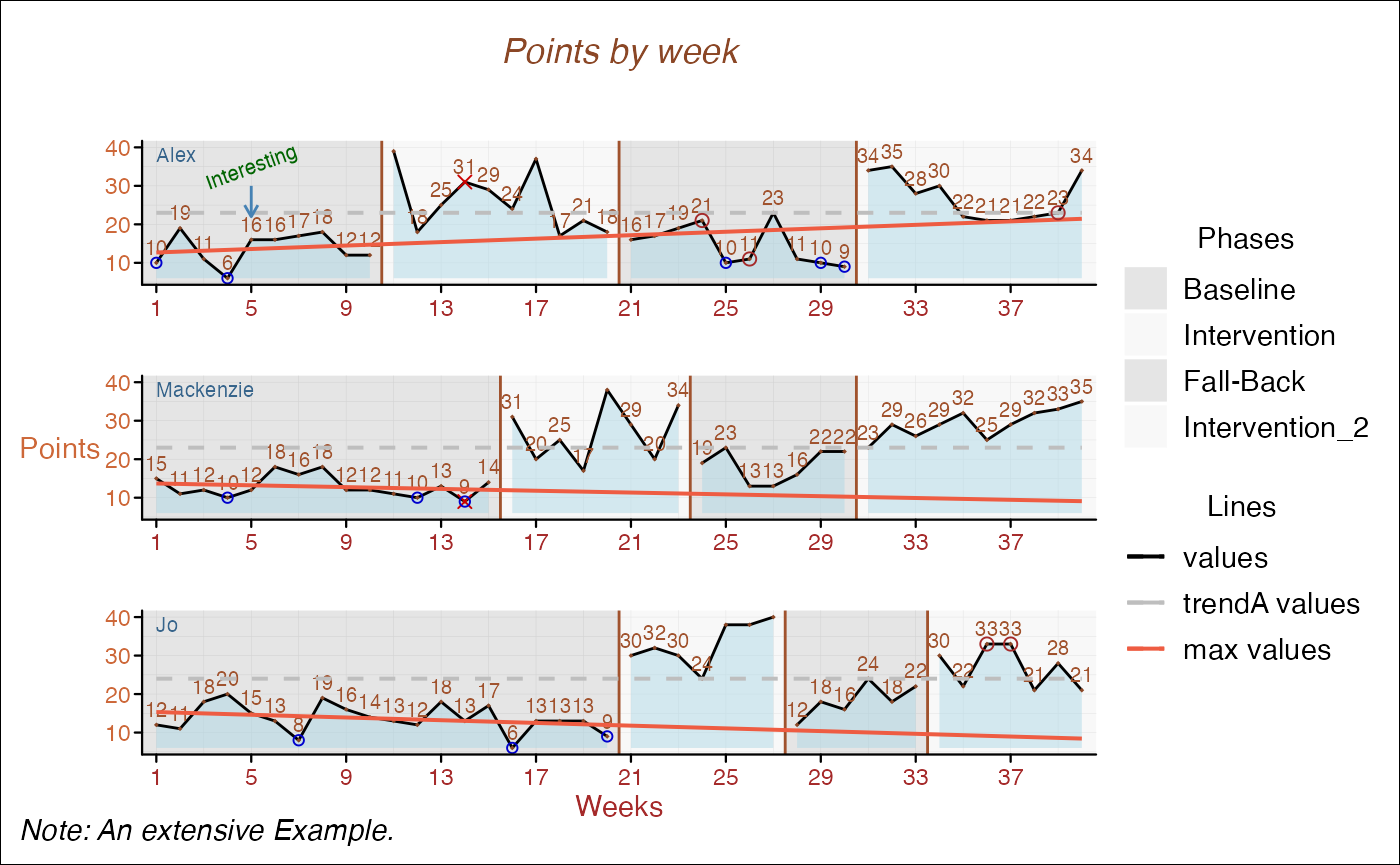
Adding bars is a bit more complicated:
- Set the
typeargument to"bar"
- Extend the limits of the x-axis by 1 (here from
0to41)
- Set the left margin of the x-axis to
0with theexpandargument.
scplot(exampleAB_add) %>%
  set_xaxis(expand = c(0, 0), limits = c(0, 41)) %>%
  add_dataline("cigarrets", type = "bar", linewidth = 0.6, point = "none") %>%
  add_statline("mean", variable = "cigarrets", color = "darkred") %>%
  add_statline("trend", linetype = "dashed") %>%
  set_casenames(position = "strip")